
| Project: | Order of the Laurel for Bronwen Rose of Greylyng |
| Words: | Mistress Mylisant Grey |
| Paper: | Arches Cold Press Watercolor |
| Script: | English Secretary Hand |
| Pens: | Turkey Feather Quills, pointed metal nib |
| Ink: | Kuretake Sumi |
| Inspiration: | Cadel based on this image, which I can't find firm details on the specific document it is from. It is similar to many other cadel H's from documents during Henry VIII's reign. Text based on Lilly Library at Indiana University, Ricketts 259, a letter from Henry VIII to Andrew, Lord Windsor. |
Inspiration & Planning
A few months ago, I worked on the calligraphy for Bronwen's Baronial Investiture scroll, done in an early period style based on the Book of Kells. When I was given the assignment for her Laurel scroll, I only had a short time to complete it, so I returned to a late period style I understand and could execute better. I decided to make a document style scroll. I asked Mistress Mylisant Grey to help me with the words, and searched for inspiration.
Several of Henry VIII's grants and other legal documents started with his name and a very impressive cadel H as the first letter. I'm still not comfortable generating Cadel letters 100% from scratch, so I asked Mylisant to start her words with the letter H, and make sure the first several words would be suitable to be large across the top of the scroll.
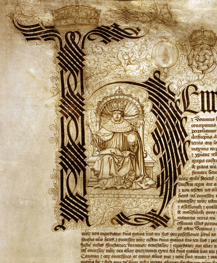
Ever since reading about it on Ian the Green's blog, Scribe Scribbling, I have wanted to use this letter as an inspiration. The hand is quite informal compared to some legal documents of the time, but it still feels right and matches the time and place of the H.

I knew right away that I wanted to use the space inside of the H for Bronwen's arms. The last element I had to include was the laurel wreath. I decided that big and bold was the way to go, so I planned on wrapping the text around a big shiny wreath in the middle of the page.
A quick note on materials
I chose to use a sheet of Arches cold press paper without ever having practiced on it. This was a bad plan... This particular cold press had a very rough texture. Getting a clean line from my quills was challenging, and often required me to pass the pen 2-3 times over the same stroke... This is a good reminder to all of you to test your tools and materials together before you commit to using them. I love the final result, but it was a bit frustrating how much this slowed me down.
Getting the Cadel Right
I decided that I wasn't going to trace this cadel, so I started by figuring out how to form it. I measured and penciled a grid of lines for the elements of the vertical. Below you can see my first test against that grid. I was still figuring out how to pen the bow.

So I practiced some more. (And smudged...)

And practiced some more...

Until I was ready to start on the final paper. You can see the the pencil guides I placed. I followed them with the left edge of the nib.

I then free-hand pencil sketched the right bow of the H. The pencil mark detailed the overall path of the pen strokes, but it wasn't measured. I carefully penned the cadel over this guideline. My focus was on getting the white space between the various strokes to be consistent as possible, which meant I didn't follow the path exactly. I made the strokes in the order that made sense to help control the spacing, instead of trying to make one continuous line.

I went back to the H after I finished the text and used a pointed metal pen to smooth the edges of the strokes, but the above is what the major strokes looked like after it was in place.
The Text
Next I had to learn the hand for the text, and do a little practice to see how well it would fit on the page. As I often do, I started by copying some of the period text to get a feel for it.

From there I broke out the individual letters to to have a quick reference. I really enjoy the open bowl on the d; the m, n, and h that are written without any lifting of the pen, and the variation of the e when used as a terminating letter.

Next, I practiced the text to make sure it would fit on the page and wrap completely under the space for the laurel wreath.

Practice complete, I added pencil guidelines lines galore and sketched the laurel wreath outline using help from my trust light box. The first line of text was penned with the same large turkey quill I used for the cadel.

I penned in the words, and then added the red ink guidelines. The red lines were penned with a Rapidograph pen filled with Ian the Green's Brazilwood Ink.

Finally, I used a wider Rapidograph with india ink to draw the outlines around the laurel wreath. Once the ink was dry, I erased all the pencil lines.

The scroll was now ready for pointed pen cleanup & filigree, color, and gold.

Because of the rough texture of the paper, the wide lines of the cadel and first line of text didn't have the smooth straight edges I wanted. Using a pointed metal nib I touched up these lines, exaggerated the pointed of strokes in the cadel, and made sure the white space between strokes in the bow of the H were even. Next I added Bronwen's arms colored with ink. The color from the inks was blotchy and didn't do what I wanted, so later on I covered it with gouache. Once the arms were in place, I added the fine line filigree in and around the cadel. In the image below, it's almost complete.

While working on the cadel, I also painted a few thick layers of Miniatum on the Laurel wreath. When it was ready, I added the gold leaf. I had to go back with a Rapidograph pen to clean up the lines between the leaves.

Finally, I added the final filigree details, painted gouache over the colored ink on her arms, and voila, the scroll was complete!
Final Thoughts
As I mentioned earlier, the big lesson I learned was to test my tools and materials together before committing to them. I'm starting to feel even more comfortable with cadels. With a little more practice, I might even be able to design them myself. For now, I'll continue to use period examples to ensure I have the right feel.
Title : « Les premieres Œuvres de JACQUES DEVAULX, pillote en la marine ».
ReplyDeleteAuthor : JACQUES DEVAULX
Publication date : 1583
Complete book in hi-res:
https://gallica.bnf.fr/ark:/12148/btv1b550024840/f1.planchecontact