| Foundations of Calligraphy | by Sheila Waters | |
| Alexandre's Rating: | ||
| ISBN-13: 978-0966530513 - John Neal Bookseller | ||
| Images of Period Examples | ||
| Historic & Paleographic Knowledge | ||
| Ductus/Instructions on Historic Scripts | ||
| Accessibility to Novice Calligraphers | ||
| Techniques for Left-Handed Calligraphers |
N/A
| |
| This book would be an excellent addition to the library of any serious student of calligraphy who wants to improve their skills. Waters does a superb job of teaching how to be an analytical calligrapher: both in how to examine a hand to learn how to reproduce it, as well as common mistakes in the formation of different scripts and how to prevent them. This is a skills focused book that is written with the beginner/intermediate calligrapher in mind. The chapters are ordered such that they help guide a novice calligrapher, generally starting with easier scripts and progressing to more difficult. It is dense, and will probably provide more benefit to someone who is comfortable with the pen and a couple alphabets already. While she includes some decent notes on the history of the scripts, you'll have to look elsewhere for detailed history and high quality extant examples of medieval calligraphy. The focus of this book is on the skills, knowledge, and techniques needed to become a better calligrapher. | 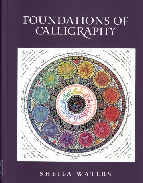 | |
Chapter by chapter review:
Chapter One - Basics & Beyond
Great information on the mechanics of including notes on setting up your writing area choosing your ink and pen, nib & reservoir adjustment, and controlling ink flow. There's excellent instruction and diagrams of how to hold the calligraphy pen and setup your writing board and slope. She also shares some "rules" on line spacing for legibility as well as methods for analyzing a script so you can copy it accurately and consistently; excellent skills for an SCA scribe to have! Information is dense, and make take several reads for novice calligraphers to get the most benefit.
Chapter Two - Roman Minuscule: Foundational Hand
Waters starts with Edward Johnson's modern Roman Minuscule as an easy - and in her opinion, critical - hand to learn for the beginning calligrapher. She starts by showing how it relates to other hands, both period and modern, and then moves into instruction on how to form the letters. Before launching into the ductus for the alphabet, she details the proper techniques involved in creating the letters to allow for consistent weight, angle, width and serifs. She also diagrams common mistakes so the novice calligrapher knows what to look for and how to prevent them. As she moves into her ductus, she continues to point out common mistakes on a letter by letter basis. Finally, she goes into detail on how to keep your spacing consistent and appropriate between letters and lines.
Chapter Three - Capitals
In this chapter, Roman Capitals are given a detailed overview in how they are formed, with specific attention to width and spacing. This is another fairly dense chapter, but full of really useful information about these complicated letter shapes.
Chapter Four - Narrow Hands: From Roman Minuscule to Blackletter
I love the concept of this chapter. It shows two centuries of evolution of calligraphy - how Carolingian Minuscule gradually became Gothic Blackletter - with practical examples. Novice calligraphers often get fixated on "what script is this?", when in reality calligraphic hands can defy simple classification. This period in particular was a slow change, and Waters does a great job showing that. She continues to include details of common mistakes and what causes them.
Chapter Five - Gothic Cursives
These are some of my favorite hands (Bastard Secretary, Bâtarde, Fraktur, etc.) and Waters' treatment of them is excellent. She shows how pen angle and minim height are linked for these "pointed gothics", and shares a few tips on the different types of pen manipulation that are required for this hand. Finally, she shares a some excellent advise on focusing on the whitespace in proper letter forming, I really like her "arches and wine glasses" note about forming consistent top and bottom arches of letters that contain them.
Chapter Six - Uncial & Half Uncial
These hands are treated to the same level of analysis as the others, with paragraphs talking about pen angle, letter shape, and the confusing naming of the two hands (hint for new calligraphers, each hand is separate, Uncial isn't the "uppercase" with Half Uncial the matching "lowercase"). This chapter has less information on the formation of letters than some of the earlier chapters. If you are really interested in getting these particular hands historically correct, you'll want to look to different books.
Chapter Seven - Carolingian
This chapter has some great historic information about the importance of this script, how and why it was developed, and how it was used. Waters makes some interesting notes about how history influenced the form of the script itself, and vice versa. She goes on to talk about how Carolingian was involved with Johnson's Foundational hand and calligraphic revival of the early 20th Century. Finally, she provides an analysis of the hand and notes on penning a modern interpretation, including notes on capitals, pen scales, slant and pen angles, letter shapes and speed of writing.
Chapter Eight - Italic
This chapters starts with an explanation of how the development of Italic started in period, but processed out of period and influenced other hands. Because of the popularity and variety in Italic, Waters recommends looking at as many period sources as possible to understand and pen the script well. She describes three period versions of this script a serious student of medieval calligraphy should be comfortable with: Informal, Semiformal and Formal. There's a bit of discussion about pen angle in relation to this hand, and how complicated that subject can be. Because of the complexity of this script, a few pen exercises are included.
Chapter Nine - Italic Variations
If chapter eight is mostly theory, chapter nine makes up for it. Three pages of examples show how variations of branching points, arch shape, letter slant and letter width interact and appear. It's a wonderful visual showing just how expressive a calligrapher can be within a single hand. The chapter also contains discussion of these variables and how to apply them to your work, and numerous modern examples.
Chapter Ten - Analysis & Practice
This chapter talks in detail about effective practice, and expresses a lot of concepts that are dear to me. She describes a method for splitting your practice time into Analytical and Rhythmical practice. Several paragraphs describe each style of practice and what to focus on. In the Analytical practice, Edward Johnson's "Seven Rules for Analyzing Hands" are explained in detail, as well as several methods of self-analysis. Rhythmical practice focuses on keeping the pen moving - know the hand well enough to keep moving, use simple prose, finish a "mini project" to refer to again in the future to see how your skill has improved.
Like with many other chapters, Waters also gives some tips on how not to practice. She finishes the chapter with a note on "calligraphic depression", where you reach a point in your practice that you feel you are (and won't) improve. I've heard much of the content of this chapter from my great great grand laurel, Master Robert, and it's great to see them expanded on and expressed in a different way.
Chapter Eleven - Design & Layout
This chapter starts with the excellent point that may calligraphy students have no background in design, and most calligraphy classes focus on making the letters. She details concepts such as spacing between lines, the size and shape of the text area, and how to include other elements. In the SCA we are blessed in that we often copy our layout directly from period examples, and learn a medieval design aesthetic through this process. Layout is a difficult concept to teach, but Waters does an admirable job introducing the ideas of unity, balance, emphasis, proportions, and movement. Descriptions and visual examples of each concept are provided to help the reader learn to look for an analyze these elements of design.
She ends the chapter detailing how design can be used to promote legibility and readability. Specifically the effect of letter, word, line, and margin spacing.
Chapter Twelve - From Conception to Completion
This chapter starts by explaining something that many new artists may not understand: art requires a lot of experimentation resulting in both failure and success. Every project will require practice to determine what size & spacing to work at, rough out the design, etc. Waters talks about her process and shows examples of her output for two different projects, from start to finish:
- Start with deep thought about the project, its content, recipient, etc.
- Sketch ideas on paper. Using pencil on separate pieces of paper.
- Continue by testing nibs, inks and colors so see how they work together.
- Create a final draft.
- Work on the final piece.
Each of these steps is discussed in detail. This is a nice chapter to see as it's a difficult subject, and as she points out, often neglected.
Chapter Thirteen - Applying Design Principles
The final chapter shows in detail how to apply the principles of design outlined in chapter eleven. As with many of her chapters, she contrasts good and bad examples of design with excellent discussion of each element.
Gallery
The book ends with a gallery of some of Waters artwork. While these are modern in nature, they show the amount of range that is possible with calligraphy, and inspiration for any one who considers themselves a calligrapher.
No comments:
Post a Comment